Featured Content
Cracking the Color Code: How to Design Better Power BI Dashboards
Step into the world of Power BI dashboards, where data visualization meets the art and the science of color!
As data-driven storytellers, color can be a superpower for conveying insights and captivating your audience. In this post, we’ll dive into the captivating realm of color, exploring key color tips for developing impactful dashboards in Power BI, including the importance of color harmonies, neutral colors, contrast, and minimal color usage. We will also dive into some of the most helpful tools: color.adobe.com - which provides curated color harmonies, and our app: Power BI Theme Generator - a quick and easy color theme generator for Power BI.
Why even consider color an important aspect when developing a dashboard?
Colors have the power to convey meaning and emotions, influencing how your data is interpreted by your audience. Here are two key reasons why color matters:
-
Meaning and Visual Hierarchy: Colors have the power to convey meaning and emotions, influencing how your data is interpreted by your audience. Choosing the right colors can help you highlight important insights, and create visual hierarchy - making your data story easier to understand.
-
Professionalism and Credibility: Colors contribute to the overall aesthetic and professionalism of your dashboard, reflecting the quality and credibility of your data analysis. In a world where data is abundant and attention spans are limited, the right colors can make your Power BI dashboards visually appealing, engaging, and impactful, helping you effectively communicate your insights and achieve your data-driven goals.
So, how do we make better color decisions for our Power BI dashboards?
Let’s dive into the previously mentioned tips of color harmonies, neutral colors, contrast, and minimal color usage.
Understanding Color Harmonies
Color harmonies refer to the combination of colors that work well together and create a visually pleasing effect. There are different types of color harmonies:
- Complementary - colors opposite to each other on the color wheel
- Analogous - colors adjacent to each other on the color wheel
- Triadic - three colors equally spaced on the color wheel
- Tetradic - four colors in a rectangle on the color wheel

Visual representation of different color harmony types on the color wheel.
One helpful tool for finding curated color harmonies is color.adobe.com, a website that provides a color wheel with prebuilt harmonies that you can easily implement in your Power BI dashboard. You can experiment with different color harmonies on color.adobe, preview and adjust them to suit your needs, making it a valuable resource for creating awesome dashboards.
When selecting colors for your Power BI dashboard, consider using color harmonies that complement each other and convey the intended meaning effectively. For instance, complementary colors can create a strong visual contrast, while analogous color harmonies create a harmonious and soothing effect. You can experiment with different color harmonies to find the one that best fits your dashboard’s purpose and design.
Utilizing Neutral Colors
Neutral colors play a vital role in balancing and complementing the use of vibrant colors in your Power BI dashboard. Neutral colors, such as grays, beige, browns, whites, and blacks, can be used for backgrounds, text, and borders to create a clean and professional look. They can provide a subtle backdrop that allows the main data and visualizations to stand out. And this is the effect we want to achieve: a background with neutral colors that let the foreground shine with the main focus of the dashboard: data and visualization.
When using neutral colors, choose shades that complement the overall color scheme of your dashboard. For example, a light gray background can make colorful visualizations pop, while dark text can provide contrast and legibility. Remember to use neutral colors strategically to create a visually pleasing and cohesive dashboard design.
Leveraging Contrast
Contrast is a crucial element in creating visually appealing and accessible dashboards. Contrast can be achieved by using colors with varying brightness, saturation, and hue. It helps highlight important data points, create a visual hierarchy, and guide users’ attention to key insights.
When using contrast, consider the color of your data points and the background. Remember the topic of neutral colors and color harmonies - well, if you use bright color harmonies for the visuals and neutral colors for the background, then the contrast is already established.
Less is More: Minimal Color Usage
Using too many colors can clutter the dashboard and make it confusing for users to understand the data. Instead, opting for a minimal color palette can create a cleaner and more cohesive dashboard design.
Limit the number of colors you use in your visualizations to the essential ones that convey meaningful insights. For example, using a single color for the card titles, or card backgrounds, and keeping the same color harmony for all the visualizations can create a simple and effective dashboard design.
Power BI Theme Generator - Color Design Power BI Dashboard
So what if there is already a tool that can incorporate these points and can generate a theme that can easily be imported into Power BI in just a few clicks - establish the color design for your Power BI Dashboard?
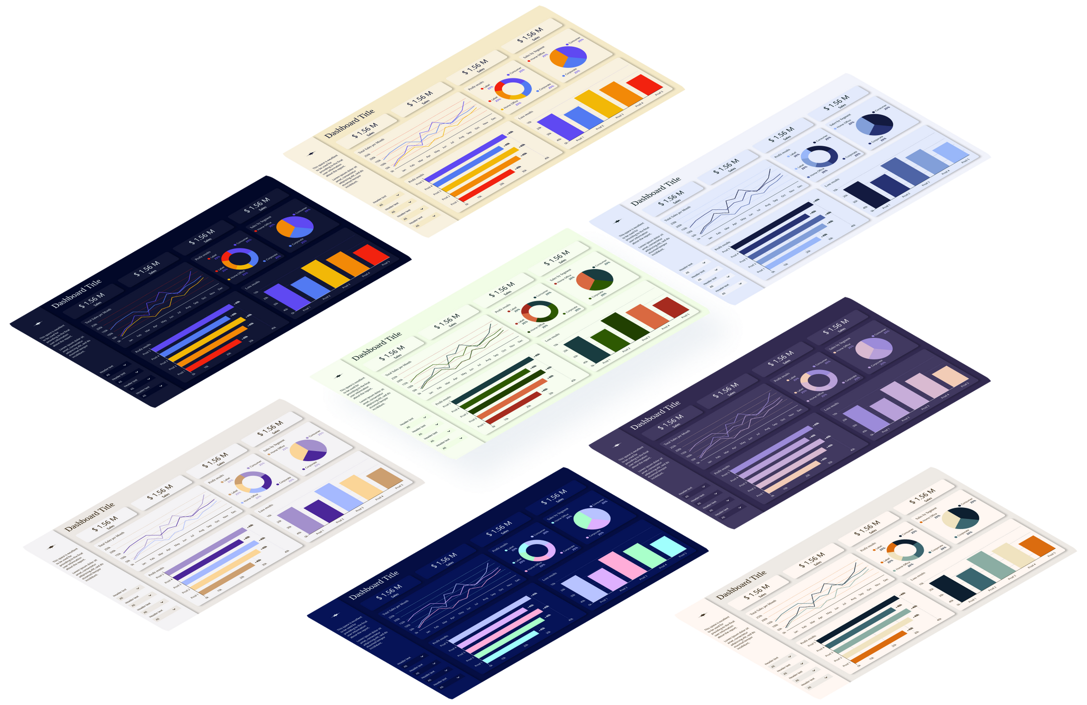
Screenshot of the Power BI Theme Generator Figma app interface.
You can apply all the rules we discussed inside Power BI Theme Generator - explore color harmonies for the visualizations and add neutral colors for the background is all you have to do to preview what your dashboard could look like. Use the app and get the JSON file of the colors you can open and apply inside your Power BI dashboard. The app is free and ready to use and if you want to get a closer look at how it works, you can watch this video:
Conclusions
Effective use of color is critical in creating powerful and impactful dashboards in Power BI. Color harmonies, neutral colors, contrast, and minimal color usage are key considerations for creating visually appealing, user-friendly, and effective visualizations. Additionally, tools like color.adobe and Power BI Theme Generator can be valuable resources for creating cohesive color themes. With these color tips and tools in hand, you can master the art of color in Power BI and create impactful dashboards that engage and inform your audience.








Comments
Share your take or ask a question below.