Featured Content

KPI Tree Studio
PartnerTurn strategy into measurable results with KPI Trees and the ROKS Method.

KPI Tree for Performance Management: A Visual 7-Step Guide
KPI Tree for Performance Management: a practical 7-step method to align strategy with KPIs, cut metric overload, and create dashboards people actually use.

Why Your BI Team Needs a Product Mindset, Not Just Reports
Discover why developing a BI team product mindset is essential for building compounding value. Learn how to shift from reactive reporting to strategic product thinking.

DAX and UDF SVG Charts in Power BI: Complete Guide
Learn to build DAX and UDF SVG charts in Power BI with this complete guide. Create custom visualizations using pure DAX code with dynamic scaling and conditional formatting.

DAX + UDF = the React of Power BI
Learn how to combine Power BI DAX user-defined functions with HTML visuals to build reusable KPI cards, tables, and progress bars that wow report stakeholders.

Automating Power BI Themes with Fabric, Notebooks and BIBB Theme Generator API: A Complete Guide
Learn how to automate Power BI report theme updates using Microsoft Fabric, Python, and the BIBB Theme Generator API for seamless theme management.

What is a Template in Power BI? Settling the debate.
Understand what each Power BI Template type does, when to use it, and how it shapes the user experience.

Improving BI User Experience in Corporate Environments: Practical Strategies That Work
Discover actionable techniques for improving BI user experience in corporate environments, focusing on user personas, training, and documentation.

Data Exfiltration in Power Query - Understanding the Risk and Protections
Data Exfiltration in Power Query: Understanding the Risk and Protections

Automation of the 'Meet the Team' PDF Slides with Power BI
Automate 'Meet the Team' PDF slides using Power BI, SharePoint, and Power Automate to save time, ensure consistency, and scale across proposals.
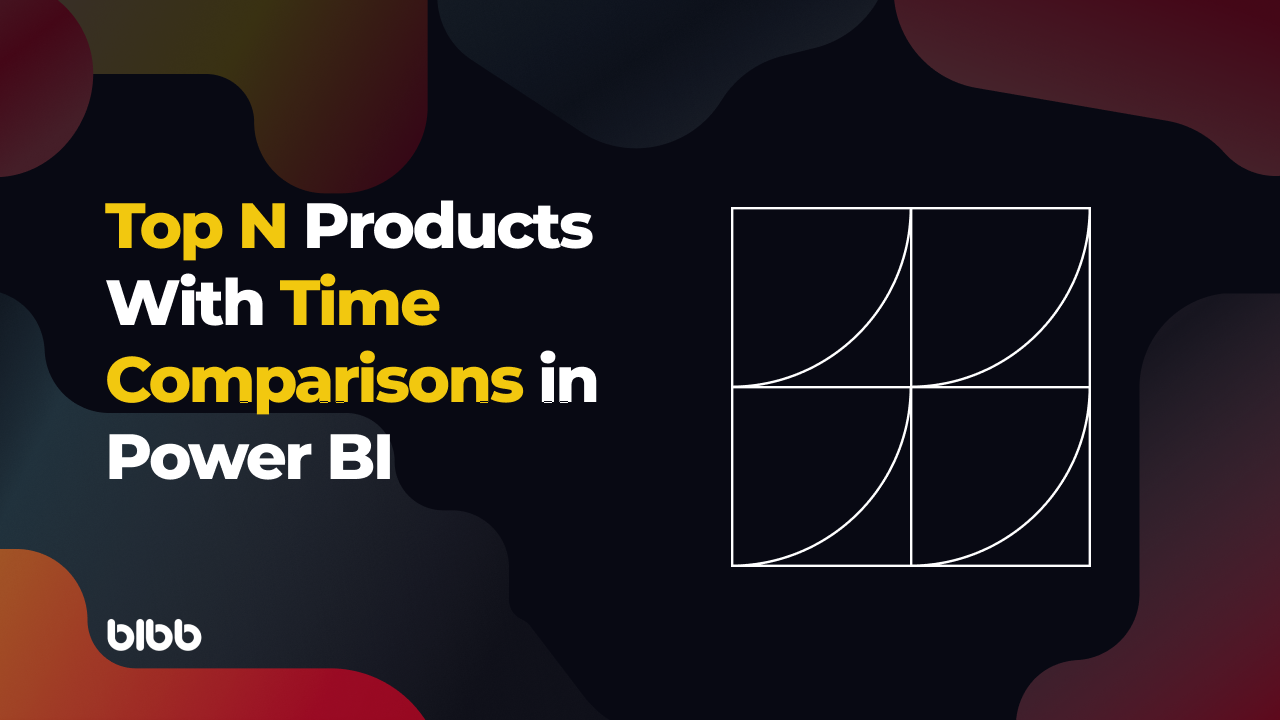
Master Power BI Time Comparisons and Top N Analysis for Optimal Performance
Learn how to perform Power BI Time Comparisons and Top N Analysis with optimal performance using calculation groups and field parameters instead of slow RANKX functions.
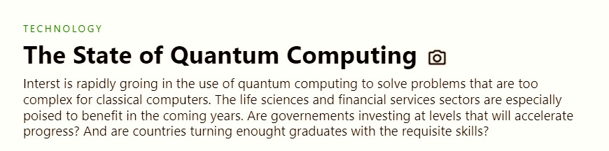
Replicating a Harvard Business Review (HBR) Infographic with Power BI, Deneb, and HTML

Power BI is a versatile tool that allows users to create visually appealing and insightful reports by integrating with various visualisation libraries such as Deneb and HTML. This makes it possible to replicate infographics from sources like the Harvard Business Review (HBR).
This blog post will show how I recreated an HBR infographic in Power BI using Deneb and HTML visuals without diving into any code.
1. HTML Header
First, we create an HTML header that sets the styling and layout for the infographic’s title and introductory text, including font sizes, colours, and margins for headings and paragraphs. This header includes the necessary HTML tags and CSS styles to display the title and subtitle of the infographic.
2. Deneb Visual: Estimated Value Unlocked by Quantum Computing
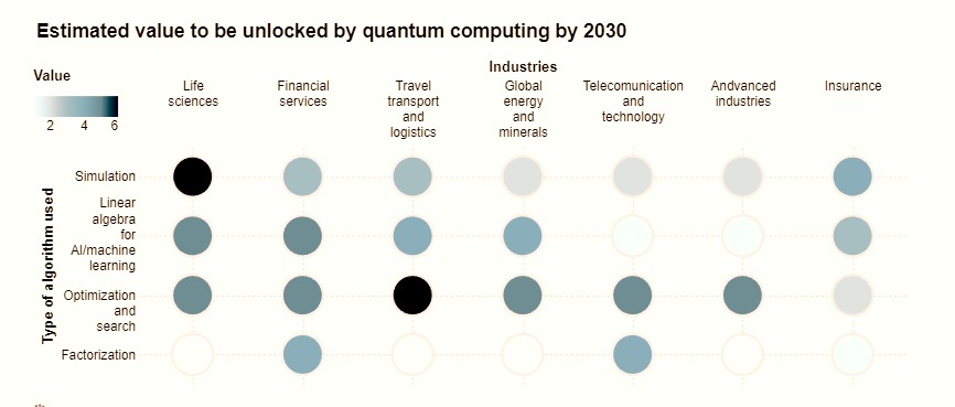
We then use a Deneb visual to represent the estimated value unlocked by quantum computing by 2030 as a scatterplot with industries on the x-axis and algorithms on the y-axis.
Each circle in the scatterplot is colour-coded based on its value, with darker colours representing higher values. The layout and design of this visual are carefully tuned to mimic the look of the HBR infographic. This graphic will display the type of algorithm used and its corresponding value in various industries.
Advanced Configuration: Breaking Categories into Lines
The most challenging part of this visual was breaking the categories into different lines. I could achieve this by adding the “labelExpr” property in the X and Y axis encoding; in this case, I break the lines by the space character.
"x": {
  "axis": {
    "labelExpr": "split(datum.label, ' ')"
  }
}
3. HTML Text: Government Funding

Next, we add an HTML visual to display information about government funding for quantum technologies, highlighting the difference in planned funding among China, the European Union, and the United States.
4. Deneb Visual: Planned Government Funding
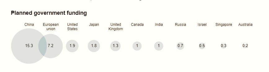
We create another Deneb visual to display the planned government funding for quantum computing across different countries as a series of circles, where the size of each circle indicates the amount of funding. The circles are colour-coded and labelled to make the data easy to interpret. This chart was not particularly complicated.
5. HTML Text: Quantum Experts

We include an HTML visual to provide more context about the pool of quantum experts and how the European Union is the clear leader in this field, with China and the United States lagging far behind.
6. Deneb Visual: Share of Global University Graduates in Relevant Fields
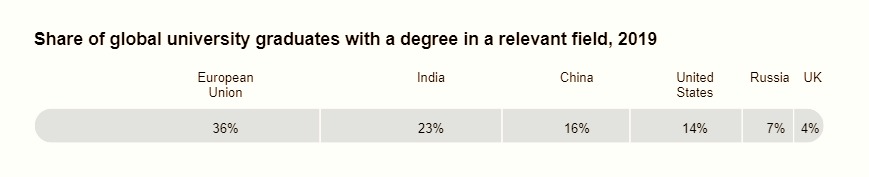
We create a final Deneb visual to show the share of global university graduates with degrees in relevant fields for quantum computing as a horizontal stacked bar chart, with each section representing a different country. The units are colour-coded but labelled and sorted to show each country’s graduates’ share clearly.
Advanced Configuration: Conditional Label Positioning
The most relevant challenge on this chart was to offset the labels and values of the text marks conditionally, and this was done using this code:
"mark": {
  "type": "text",
  "dx": {
    "expr": "datum.Index == 1 ? -80 : datum.Index == 2 ? -60 : datum.Index == 3 ? -45 : datum.Index == 4 ? -40 : datum.Index == 5 ? -15 : -12"
  }
}
7. HTML Footer
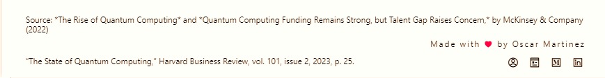
To conclude our infographic, we add an HTML footer that credits the data sources and cites the original HBR infographic. The footer uses smaller font sizes and margins to differentiate it from the main content of the infographic.
Conclusion
By leveraging the capabilities of Power BI, Deneb, and HTML, we have successfully replicated an HBR infographic illustrating the state of quantum computing. This powerful combination of tools enables users to create visually engaging and informative reports, making it easier to communicate complex information and insights to a broader audience.
The exercise of replicating a Harvard Business Review Infographic with Power BI was a great way to flex my Deneb and HTML muscles.
Comments
Share your take or ask a question below.