Featured Content

KPI Tree Studio
PartnerTurn strategy into measurable results with KPI Trees and the ROKS Method.

KPI Tree for Performance Management: A Visual 7-Step Guide
KPI Tree for Performance Management: a practical 7-step method to align strategy with KPIs, cut metric overload, and create dashboards people actually use.

Why Your BI Team Needs a Product Mindset, Not Just Reports
Discover why developing a BI team product mindset is essential for building compounding value. Learn how to shift from reactive reporting to strategic product thinking.
DAX and UDF SVG Charts in Power BI: Complete Guide
Learn to build DAX and UDF SVG charts in Power BI with this complete guide. Create custom visualizations using pure DAX code with dynamic scaling and conditional formatting.

DAX + UDF = the React of Power BI
Learn how to combine Power BI DAX user-defined functions with HTML visuals to build reusable KPI cards, tables, and progress bars that wow report stakeholders.

Automating Power BI Themes with Fabric, Notebooks and BIBB Theme Generator API: A Complete Guide
Learn how to automate Power BI report theme updates using Microsoft Fabric, Python, and the BIBB Theme Generator API for seamless theme management.

What is a Template in Power BI? Settling the debate.
Understand what each Power BI Template type does, when to use it, and how it shapes the user experience.

Improving BI User Experience in Corporate Environments: Practical Strategies That Work
Discover actionable techniques for improving BI user experience in corporate environments, focusing on user personas, training, and documentation.

Data Exfiltration in Power Query - Understanding the Risk and Protections
Data Exfiltration in Power Query: Understanding the Risk and Protections

Automation of the 'Meet the Team' PDF Slides with Power BI
Automate 'Meet the Team' PDF slides using Power BI, SharePoint, and Power Automate to save time, ensure consistency, and scale across proposals.

Master Power BI Time Comparisons and Top N Analysis for Optimal Performance
Learn how to perform Power BI Time Comparisons and Top N Analysis with optimal performance using calculation groups and field parameters instead of slow RANKX functions.
UX/UI applied to my Power BI report - Part 1: Navigation

Navigating UX/UI in Power BI: Key Principles for Better Report Design
Do I need a UX/UI-focused navigation bar in my Power BI report?
While the answer may seem obvious, understanding why UX/UI Power BI navigation is essential can elevate your report design. This post introduces some core principles of User Interface (UI) and User Experience (UX) to help guide your Power BI report’s navigation.
Navigation is an essential part of the User Interface
There are two concepts that we are going to develop very briefly in this post. The first one is the User Interface (UI), which consists of a set of elements (visual or functional objects) with which the user interacts. The second one is the User Experience (UX), which focuses on the end user’s overall experience with the product so the UI is one of the aspects that encompass the UX and contributes significantly to the user experience of a digital product, such as our Power BI report.
Following this idea, we can start by adopting another approach to our reports and starting to see them as digital products; as such, we can consider certain usability principles. We take up a UX principle called Jakob’s Law, applied to web design; but why would I want to consider UX, UI, or web design principles in my reports?
Well, it’s all about familiarity and learned experiences, but let’s see what Jakob’s Law says:
“Users spend most of their time on other sites. This means that users prefer your site to work the same way as all the other sites they already know.”
What are the implications of this principle for report design?
Users build mental models of experiences learned around using a familiar product and transfer them to similar products.
For our task in the design of a report (our digital product), we take advantage of the mental model of the end-user of the report, built from navigation within websites or apps to transfer that experience to a similar product such as our report, facilitating its use, exploration, and interaction with it, maximizing the user experience through the adoption of an element or convention of usability and navigation already known and facilitating the main goal of the user (find the information they are looking for).
When we design our report, we prepare a product that will be consumed in a browser, so it is vital to keep these UX and UI principles in mind to take our design to another level.
Understanding navigations
It is crucial when designing your report to determine the navigation based on the end-user, the structure of your report, and the information in it, considering in your design existing conventions that can be transferred and reused, such as commonly used bars, tabs, and buttons, horizontal layout at the top or vertical to the left for navigation.
Without pretending to be an exhaustive list, just considering the fundamental aspects, navigation helps the users of your reports in the following ways:
- Know that the information is segmented - Shapes the report
- Helps in user orientation - Users understand where they are
- Enables a way to access the information - Clear pathways to content
- Move through the report/sections - Smooth transitions between areas
Important: Not all navigation patterns are the same
Basic Navigation Elements
Understanding the fundamental building blocks of navigation will help you create more intuitive interfaces:
• Bar
The bar is a section of the user interface that allows integrating elements that can be interacted with, enabling navigation, which has a direct relationship with the usability of our report.
• Buttons
These elements communicate and enable the user to initiate or take actions within our interface.
• Tabs
These elements organize information into groups of content and allow you to navigate through them to help users find them easily.
Power BI Navigation Elements
Power BI has features and elements that will allow us to build a better navigation experience; in a recent update, new elements were incorporated to create a page and bookmark navigators; another option for navigation, available for some time is the use of blank buttons which can be customized and set the type of action they will perform, in our case “Page navigation.”
Instead of taking advantage of the new features of “Page and Bookmark Navigators,” I prefer to make the navigation sidebar using blank buttons because, in my opinion, it provides more formatting and customization options for each button state that fits a more compact design of a sidebar and more graphical through the use of icons on each button.
Building the navigation by using buttons, shapes, icons, bookmarks, and other options available in Power BI will be covered in the next post; in the meantime, you can subscribe to BIBB and download the sample template.
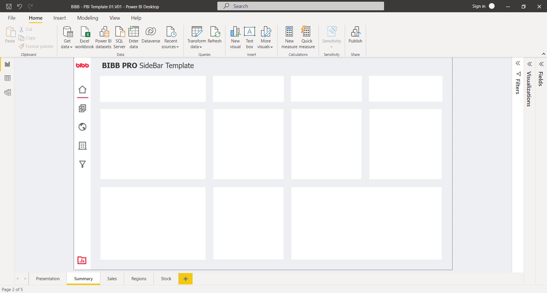
Power BI template (Navbar example)
When designing your next awesome report, don’t forget to consider and practice these concepts behind the tool and the functions that you can find in Power BI.
Example of a well-designed navigation bar in Power BI that follows UX/UI best practices.
Comments
Share your take or ask a question below.