Featured Content
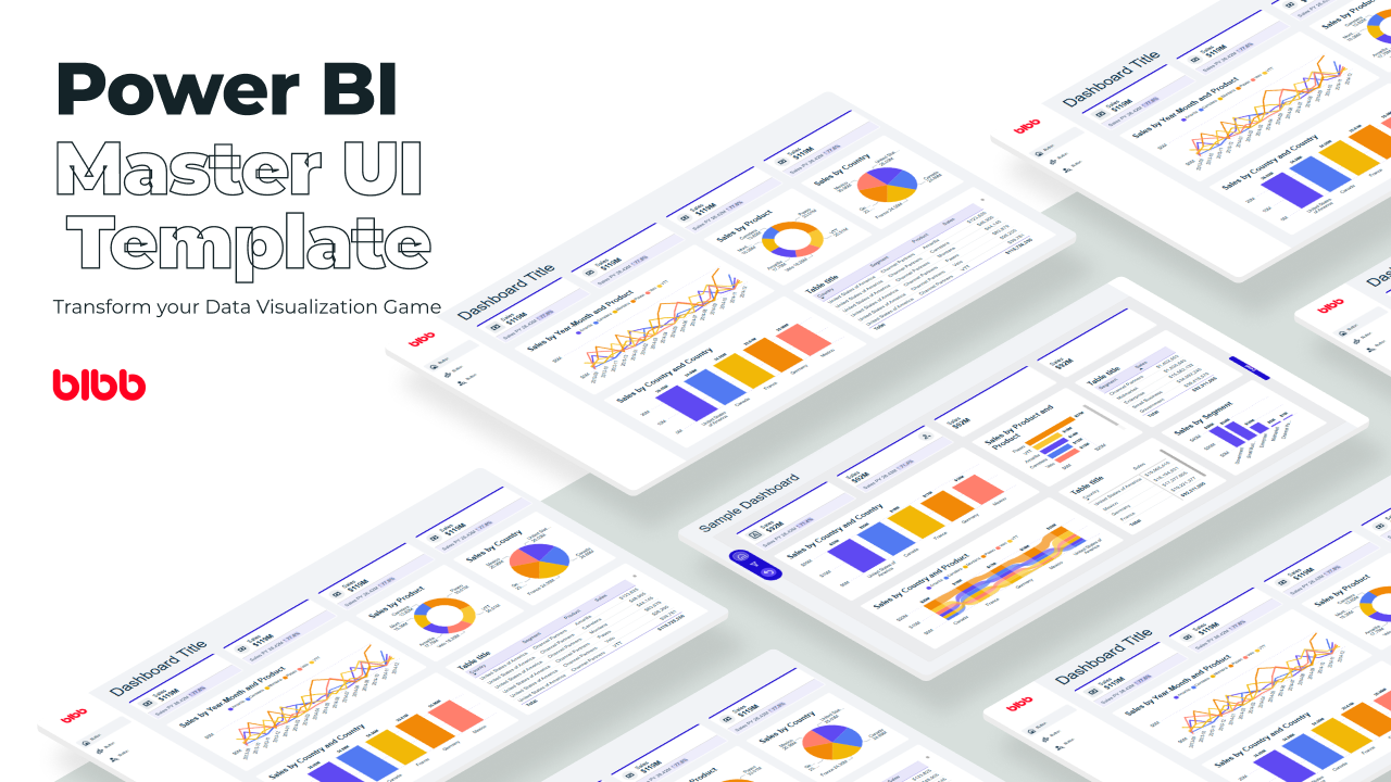
Power BI Master UI Template
Develop Data Visualization 80 % Faster - 4 Premium Templates · 7,000 Icons · 100% Theme Generator compatible
6 Power BI Modern Button Slicer UI Patterns for Better Dashboards
Learn 6 Power BI Button Slicer UI patterns to build modern dashboards: segmented controls, tabs, KPI cards, toggle buttons, and more.
Salesforce Power BI Integration: A Practical Comparison Guide
Salesforce Power BI integration done right: compare native connectors, custom API, and the Metrica connector to choose the best approach for your team.

How to Design Better KPIs Before They Mislead You
How to design better KPIs starts with knowing what your formula isn't measuring. A real BI case study in dashboard blind spots, with DAX examples and a fix.
AI Agent Skills: Stop Paying for Tokens You Don't Need
AI agent Skills replace bloated instruction files with on-demand context loading — cutting token waste by 80% for Excel and Power Query workflows.
KPI Tree for Performance Management: A Visual 7-Step Guide
KPI Tree for Performance Management: a practical 7-step method to align strategy with KPIs, cut metric overload, and create dashboards people actually use.

Why Your BI Team Needs a Product Mindset, Not Just Reports
Discover why developing a BI team product mindset is essential for building compounding value. Learn how to shift from reactive reporting to strategic product thinking.
DAX and UDF SVG Charts in Power BI: Complete Guide
Learn to build DAX and UDF SVG charts in Power BI with this complete guide. Create custom visualizations using pure DAX code with dynamic scaling and conditional formatting.
DAX + UDF = the React of Power BI
Learn how to combine Power BI DAX user-defined functions with HTML visuals to build reusable KPI cards, tables, and progress bars that wow report stakeholders.
Automating Power BI Themes with Fabric, Notebooks and BIBB Theme Generator API: A Complete Guide
Learn how to automate Power BI report theme updates using Microsoft Fabric, Python, and the BIBB Theme Generator API for seamless theme management.
What is a Template in Power BI? Settling the debate.
Understand what each Power BI Template type does, when to use it, and how it shapes the user experience.
Build a Navbar using buttons in Power BI

In this post, we’ll have a brief review of some design and formatting guidelines for building a navigation bar in Power BI, so let’s get started.
Design considerations
Selection of theme and colors
Colors are a powerful tool in design as they can deliver a message, meaning, or relevance to each element that integrates our report. The right color for each component can catch the attention and communicate a specific message in a complex or saturated visual environment such as a report can be.
As a data analyst and report designer, color is a useful tool that should not be underestimated; in most cases, color has a message to give, and that’s why it’s necessary to provide it with importance when designing the report; it’s not about choosing a theme for mere taste since preference for specific color may not always drive well the message you want to bring to the end-user of the report.
Power BI has several themes to work with as default, so you’ll have to select the colors to adjust the states, icons, effect of your buttons, and other elements (Visual objects) used to achieve a uniform design in terms of color.
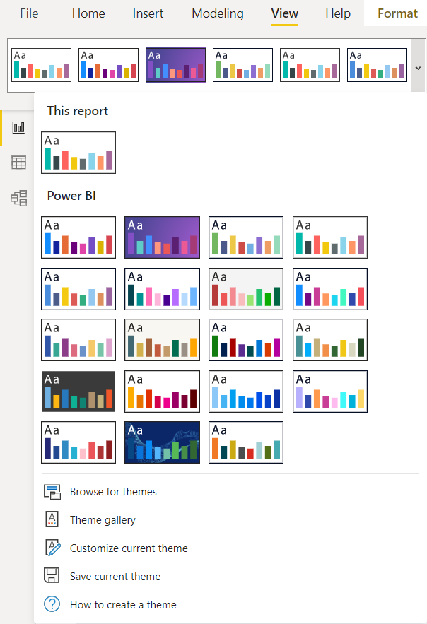
Power BI default themes selection interface showing various color palette options.
If you haven’t a custom theme, you can select a theme base and choose two colors (primary and secondary) that you will use for the interactions with your buttons; in our example, we used the BIBB color palette to keep the brand identity and selected grey and red for our icon buttons.
Less is more when using colors in your report.
Selecting icons
Depending on how many pages your report will have and the utilities you add (Popup windows) will be the number of buttons and icons you’ll use for your navigation bar; for the example we use seven buttons, 5 for pages (Presentation, Summary, Sales, Regions, Stock), 2 for Popup windows, so we use a different icon for each button considering its variations in terms of type (linear or filled) and color, to use them in each state of the button.
Your options can be many, depending on your color palette and the elements you integrate, so it’s a good idea to limit the color for interactions and have the hex color code to work with a custom palette; also if time permits, you can do a color test with your icons and their variations as in the following example:
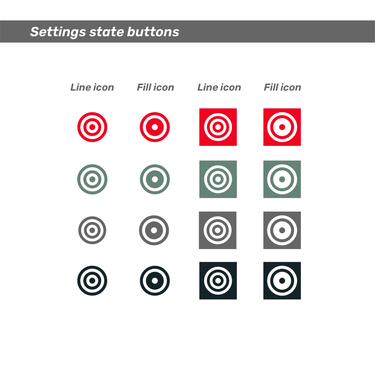
Example of icon variations showing different states and colors for navigation buttons.
Note: The icons used were from RemixIcon
Implementation Steps
1. Insert Blank Buttons
Let’s start our vertical navigation sidebar by inserting blank buttons, which you can easily find in the Insert ribbon (Insert > Elements > Buttons > Blank); the size and location of the button can be modified in the Format Button pane (Format Button > General > Properties > Size/Position), in the same pane you can change the other settings of style and states buttons that will see later.
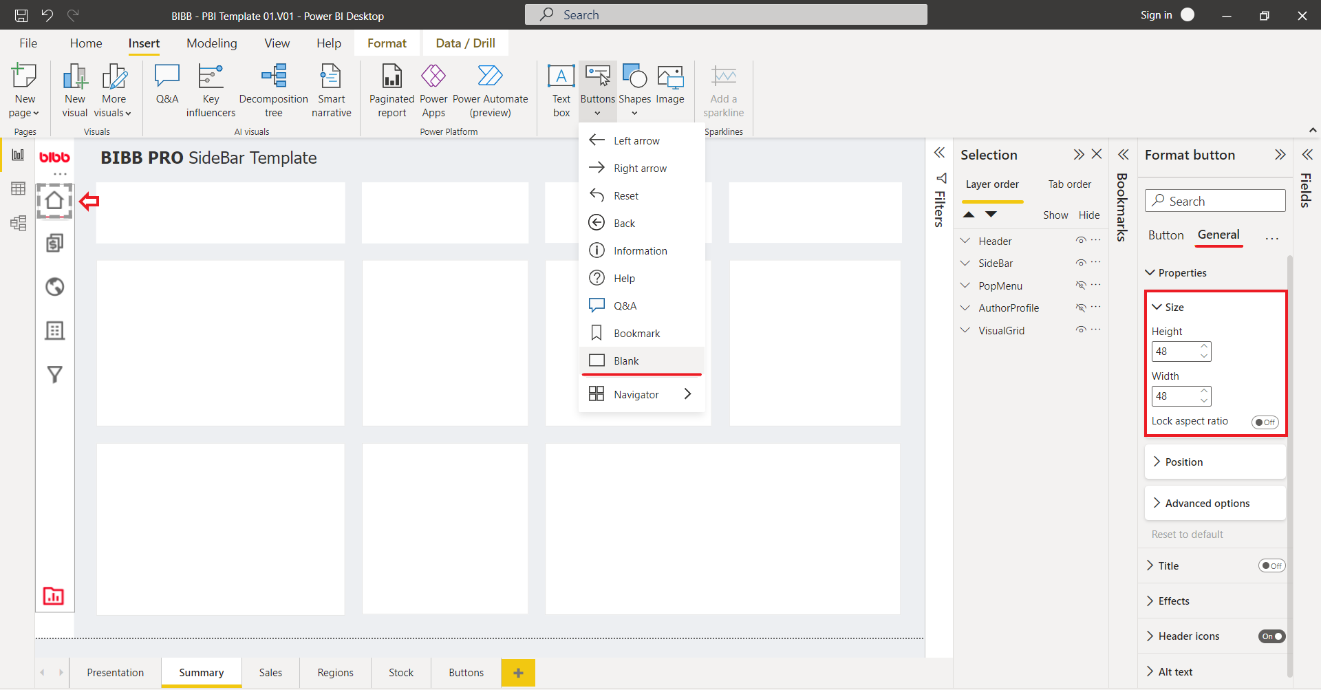
Location of the Insert Blank Button option in Power BI’s ribbon interface.
2. Button dimensions and states
Button dimensions
Well, that depends on the type of button, function, and the format for viewing the report (Desktop or Mobile); our template is designed for desktop view, and the type of button is an icon button, which allows us to reduce its size, as we seek a compact design; we use a rectangular shape with 56px width for the bar, it’s enough space to insert our buttons with a dimension of 48 px for 48 px, with these measures we can align and center well all buttons we add to the bar.
Button states
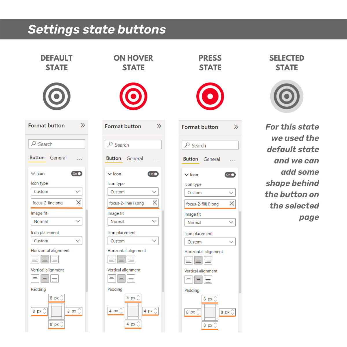
The general purpose of different states of the button is to communicate an explicit action to the user; since the buttons are part of the user interface, the states’ variation must be distinguished from the other elements surrounding it in the report.
- Default (D-State) - A default state shows the button with no interactions.
- Hover (H-State) - A hover state communicates when a user has placed a cursor above the button.
- Press (P-State) - A pressed state communicates a user click.
- Selected (S-State) - A selected state communicates a user interaction (choice, destination, action, etc.)
The button states must be clearly differentiated from each other.
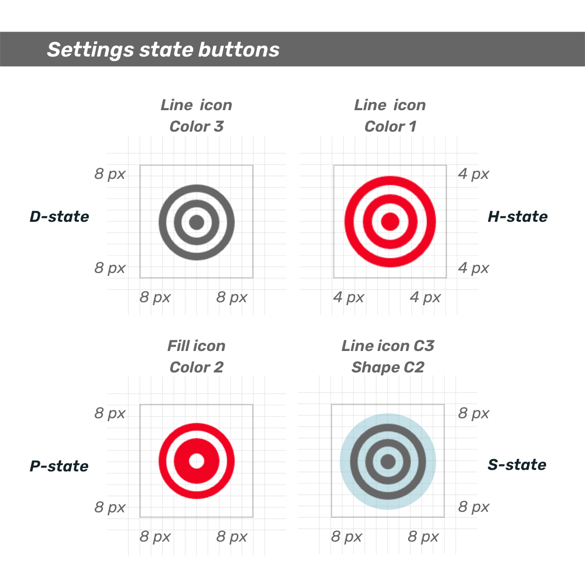
Visual representation of the four different button states with clear visual distinctions.
3. Button format settings
The following images show in a simple way how to differentiate the buttons states by changing the color of the icons and adjusting the padding, settings that you can make in the Format button panel, when you select a button Format button > Button > Style > Apply settings to > State, in the first image show where we can choose the different states to define them. On Format button > Button > Style > Icons is where we insert the selected icons and modify the padding for each state of the controller.
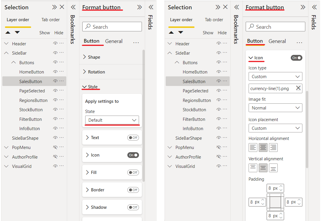
Format button panel showing how to select different button states for configuration.
Format button panel icons section showing icon selection and padding options.
4. Layout and organization of elements
We work on a canvas, and as such, we build layer upon layer the elements that will integrate our report, in this case, our navigation bar, so it’s convenient to have a workflow considering the order of the component we use, the Selection Panel is handy, here is where you can view all the elements of your report, name them, group them, organize them by layers, make them visible or hide them, this last function is used to make bookmarks that we’ll see in another post.
Selection panel showing organized layers and grouped elements for the navigation bar.
Is advisable to build your report section by section.
It may be useful to adopt the following design routine:
- Select and place the elements.
- Name each element.
- Sort them by layers (which element goes above or below another).
- Group them.
- Name the grouped section.
- Sort the new group in the selection panel.
- Hide it if necessary and continue to build the next section.
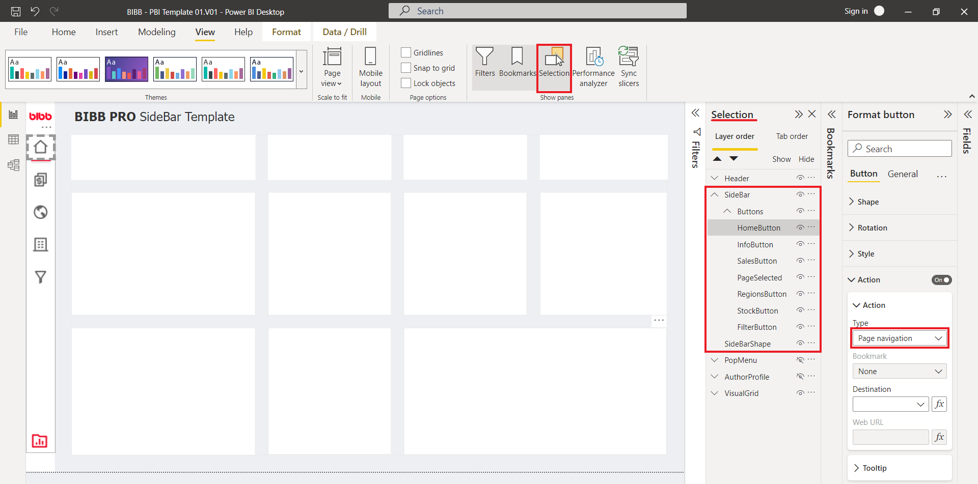
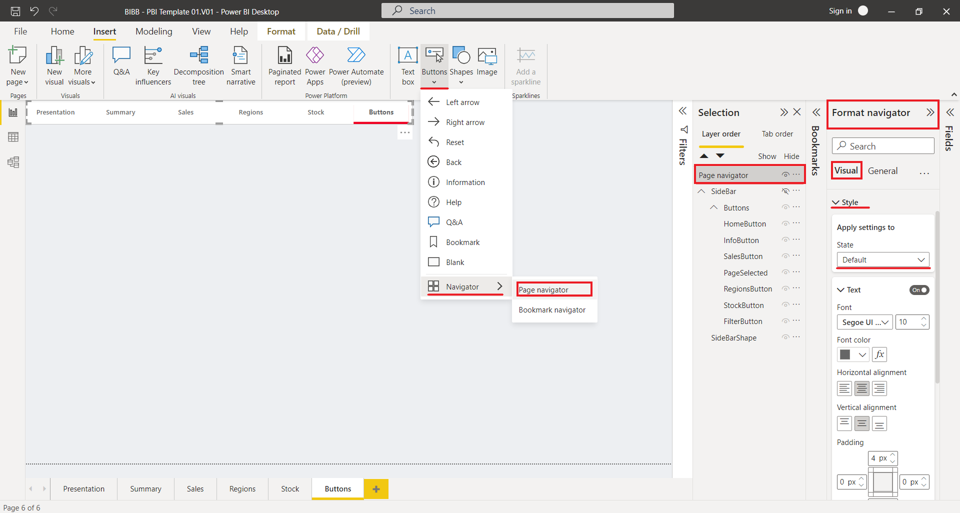
5. Assign action to the button
At this point, we have already located, aligned, and spaced the elements of our navigation bar, the base shape, and its buttons, named each element, organized, grouped, and assigned the corresponding icon to each state of the button, so we can start to give functionality to the buttons by assigning an action for which we select “Page Navigations” in the “Action type,” and the page to which the button direct us in “Destination,” in our example the sales button drive us to the sales page, as is shown in the following image:
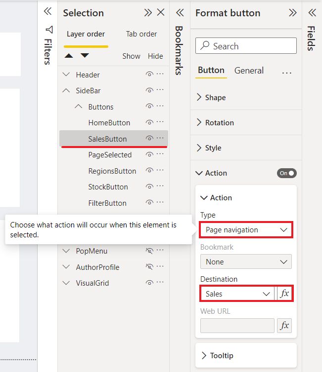
Button action configuration panel showing Page Navigation setup with destination selection.
Once we assign the destinations of each button, we’ll have finished our navigation bar, and you can continue building the following sections of your report.
Additional Notes
It’s worth mentioning that Page Navigation Buttons were recently introduced in Power BI, which integrates into a single visual object the navigation buttons without the need to group individual buttons, making it easier to configure their state and format; in my opinion, using blank buttons allows to explore more options when designing your report; however, it’s a good improvement that we’ll explore in a future post.
Power BI’s new Page Navigation Buttons feature as an alternative to manual button creation.
I hope you found this brief explanation of how to build a navigation bar useful, and you’ll enjoy this template in the design of your next awesome report.
Comments
Share your take or ask a question below.