Featured Content
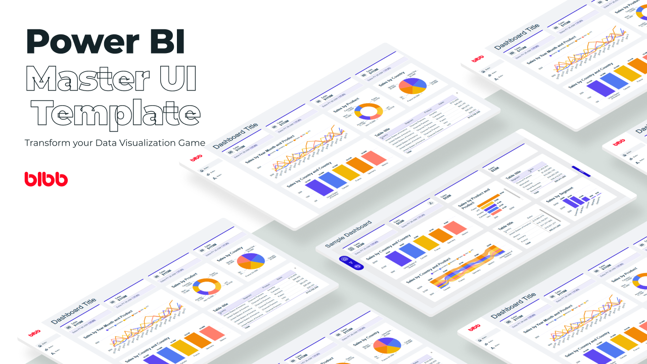
Power BI Master UI Template
Develop Data Visualization 80 % Faster - 4 Premium Templates · 7,000 Icons · 100% Theme Generator compatible
6 Power BI Modern Button Slicer UI Patterns for Better Dashboards
Learn 6 Power BI Button Slicer UI patterns to build modern dashboards: segmented controls, tabs, KPI cards, toggle buttons, and more.
Salesforce Power BI Integration: A Practical Comparison Guide
Salesforce Power BI integration done right: compare native connectors, custom API, and the Metrica connector to choose the best approach for your team.

How to Design Better KPIs Before They Mislead You
How to design better KPIs starts with knowing what your formula isn't measuring. A real BI case study in dashboard blind spots, with DAX examples and a fix.

AI Agent Skills: Stop Paying for Tokens You Don't Need
AI agent Skills replace bloated instruction files with on-demand context loading — cutting token waste by 80% for Excel and Power Query workflows.

KPI Tree for Performance Management: A Visual 7-Step Guide
KPI Tree for Performance Management: a practical 7-step method to align strategy with KPIs, cut metric overload, and create dashboards people actually use.

Why Your BI Team Needs a Product Mindset, Not Just Reports
Discover why developing a BI team product mindset is essential for building compounding value. Learn how to shift from reactive reporting to strategic product thinking.
DAX and UDF SVG Charts in Power BI: Complete Guide
Learn to build DAX and UDF SVG charts in Power BI with this complete guide. Create custom visualizations using pure DAX code with dynamic scaling and conditional formatting.

DAX + UDF = the React of Power BI
Learn how to combine Power BI DAX user-defined functions with HTML visuals to build reusable KPI cards, tables, and progress bars that wow report stakeholders.
Automating Power BI Themes with Fabric, Notebooks and BIBB Theme Generator API: A Complete Guide
Learn how to automate Power BI report theme updates using Microsoft Fabric, Python, and the BIBB Theme Generator API for seamless theme management.

What is a Template in Power BI? Settling the debate.
Understand what each Power BI Template type does, when to use it, and how it shapes the user experience.
Having a Light and Dark Version of Your Power BI Reports

“It was the possibility of darkness that made the day seem so bright.” — Stephen King.
The Case for Having Power BI Light and Dark Versions
For a couple of years, we’ve seen a boom in applications supporting dark versions of their interfaces, and Power BI is not the exception. Creating a dark, light version of analytics reports can benefit business intelligence developers:
Accessibility: Dark versions of reports can facilitate reports consumption and improve accessibility for those with visual impairments to consume reports more efficiently.
Users’ preference: Dark mode can also provide a more aesthetically pleasing experience for users, making it more enjoyable to interact with the report.
Create a modern and attractive UI/UX for users with a range of preferences.
In Power BI, there are three main approaches for creating these two versions of your reports, and, like almost everything in this life, choosing any method means opportunities and compromises; let’s dive through them:
1. JSON Themes (Preferred Approach)
You can achieve your report’s dark and light versions by applying report themes. Using a theme is very easy and doesn’t take more than a couple of seconds and clicks to apply one.
Two different JSON themes and two PBIX files must be created, each with a different theme. In this case, the toggle button has a Web URL action that directs the user, in a new tab, to the other version of the Power BI report.
When I first wrote this post a couple of years ago, creating themes was something time-consuming and required some knowledge of JSON structures. Thanks to BIBB’s Power BI Theme Generator, this is done in a breeze today.
 BIBB’s Power BI Theme Generator makes creating themes quick and easy.
More information about themes: Use report themes in Power BI Desktop - Power BI | Microsoft Learn
✅ Pros:
- Applying themes is as quick as a finger snap
- No need for complex bookmarks
- Replicable approach
- Fine control of elements
❌ Cons:
- Change between modes happens by navigating to a different report
2. DAX Approach
Since the first time I wrote this article, there has been a lot of exploration of creating Power BI files with both modes, and one method has been gaining traction: the DAX one.
The DAX method uses conditionally formatting Power BI visuals based on DAX formulas; the measures created require switching the HEX colours based on a selected parameter. As with all DAX subjects, there is no single approach, and different DAX functions can be used to achieve the result.
This method is very time-consuming and not bulletproof, as many visuals have properties that cannot be conditionally formatted.
Below, you will find some good resources about how to achieve this DAX method:
- Creating a dark and light theme for your Power BI report – Side Quests
- Power BI Guy - Create reports with a light and dark mode in Power BI
- Captain Platform - Create a Dark/Light mode switcher in Power BI!
- Power BI - Dark and Light Mode
✅ Pros:
- DAX is straightforward and not complicated
- Switch between modes in the same report
❌ Cons:
- Not easily replicable
- Conditional formatting needs to be applied to every visual
- Time-consuming
3. Duplicate Items Approach
 Creating duplicate versions of visuals for light and dark modes.
Creating two versions of each item in the same report is the least recommended approach.
You must make two versions, dark and light, of almost every element and visual on your report. Also, you have to add a box covering all the report’s areas acting as the alternative background; these elements need to be hidden and unhidden through bookmarks, which need to be assigned to buttons.
This approach is suitable for newbies in Power BI as there is much learning potential in the Visual formats and Bookmarks management area.
Like the DAX approach, I would not recommend this one for the busy BI professional, mainly because it is time-consuming.
For more information about making buttons and bookmarks, refer to this great video from Guy in a Cube: Power BI Bookmarks, Selections and Toggles
✅ Pros:
- You can do it all within Power BI desktop
- No need to learn JSON structures
- Quicker to make changes on the fly
- The transition between modes happens within the same report
❌ Cons:
- Not easily replicable
- Challenging if you have many bookmark interactions
- Time-consuming
Conclusion
It is probably not hard to guess that my preferred option is the first one (JSON themes); regardless of your chosen method, my only suggestion is that when creating your reports, always keep your end-users in mind and always make your best effort to make the experience of using your report a pleasant one.
The JSON themes approach offers the best balance of ease of implementation, maintainability, and professional results. While it requires separate report files, the time saved in development and the consistency achieved make it the most practical choice for most scenarios.
Comments
Share your take or ask a question below.